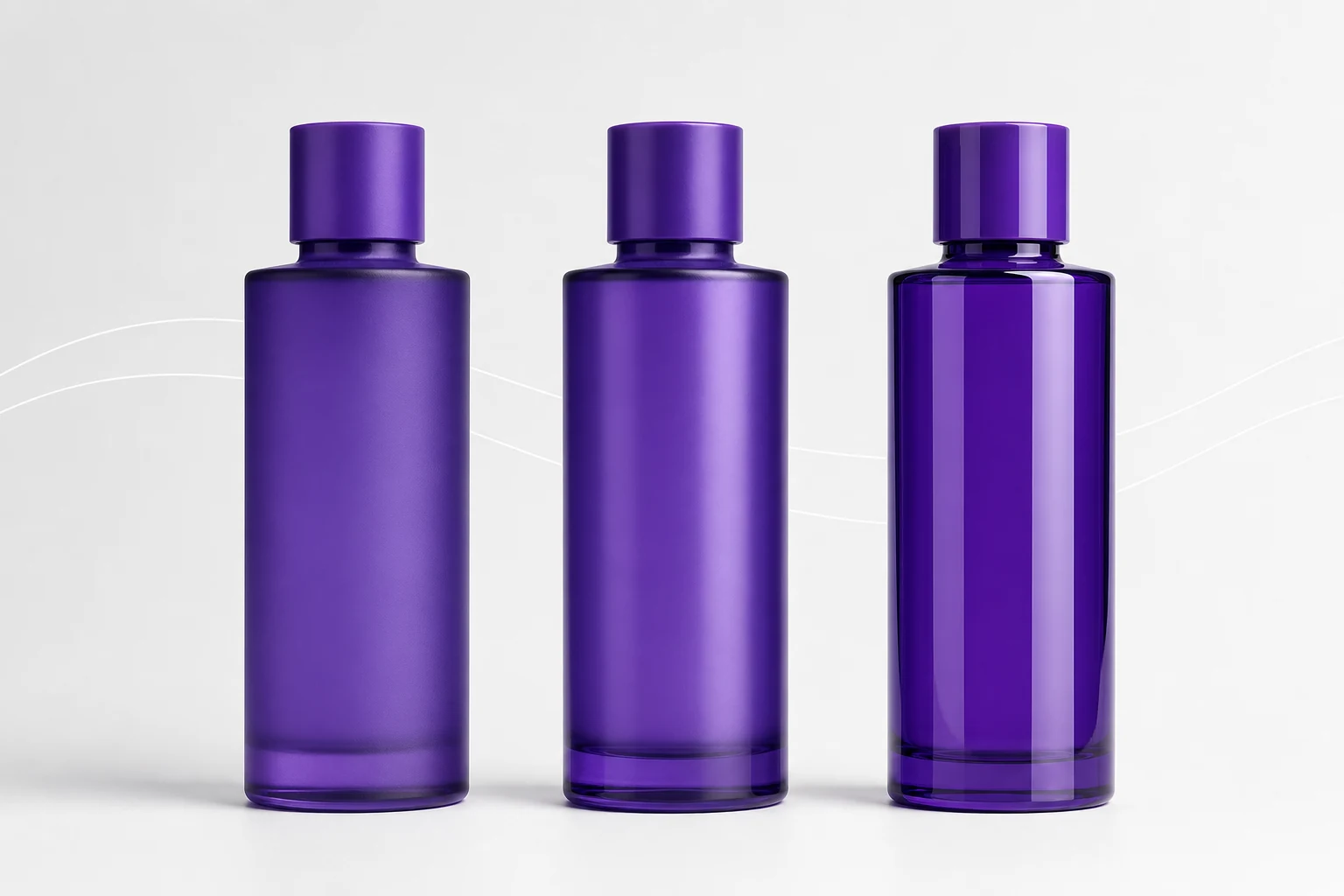
Specialty finishes depend on controlled pigment or flake behavior, film smoothness, substrate interaction, and viewing angle, so they should be approved as physical coated packages rather than digital color chips.
Specialty effects are optical materials, not filters placed over a flat color. Their success depends on particle scale, orientation, film build, surface smoothness, background, clear layer, and lighting. That is why a convincing physical effect can look ordinary in one photograph and dramatic as the package turns.
Metallic
A metallic finish uses reflective pigment or flake to create directional highlights and a sense of metal depth. A good packaging metallic should read as a coherent surface rather than simply a darker glossy color.
Fine metallics create an even sheen suitable for small containers and overprinted artwork. Coarser metallics create more visible sparkle but can compete with fine type. Bonding metallic pigment to powder particles can help distribution and application consistency. The Powder Coating Institute specifically treats metallic bonding and application as an advanced aesthetics topic. See its metallics program overview.
Metal flake
Metal flake should present discrete, fine points of reflection suspended within a visually smooth coating. It should not look like square pixels, random dirt, or a uniformly rough surface.
Flake scale determines the design language. Fine flake produces restrained movement and is usually more compatible with detailed printing. Larger flake is more expressive but demands enough viewing distance and film clarity to read properly.
Control points include:
- Flake size and concentration
- Distribution around the full circumference
- Film smoothness over the flake
- Orientation changes at shoulders and tight radii
- Reclaim and batch consistency
- Contrast behind direct-print artwork
Pearlescent
Pearlescent pigments create soft, layered reflection rather than a mirror-metal effect. They often shift in brightness more than hue and can make light colors feel dimensional without introducing obvious sparkle.
Pearlescent effects are sensitive to the base color. A white pearl, blue pearl over black, and warm pearl over cream can use related materials yet produce very different packages. Always identify both the effect layer and the background it was approved over.
Prismatic and iridescent
Prismatic effects should create a controlled color shift as the viewing or illumination angle changes. The effect is not random multicolor mottling. Its quality comes from a relatively coherent optical response over the surface.
Curved bottles are particularly effective because multiple angles are visible at once. However, the same curvature makes evaluation difficult: the apparent hue can change from front to edge even under one light source. Approve the package in motion and under more than one lighting environment.
Frost
Frost is a light-scattering effect. On glass, it can preserve translucency while reducing clarity and reflection. On metal, the same design direction must remain opaque because the substrate itself is opaque. “Frost” on metal therefore describes the soft, low-sheen visual character, not transparency.
Frost uniformity is usually more important than maximum texture. Excessive roughness can trap contamination, interfere with direct print, or make the surface look poorly atomized rather than intentionally frosted.
| Effect | Primary optical behavior | Artwork consideration |
|---|---|---|
| Metallic | Directional reflective sheen | Use adequate contrast and inspect fine type |
| Flake | Discrete sparkle with depth | Keep critical details clear of visual noise |
| Pearlescent | Soft layered brightness | Approve over the exact base color |
| Prismatic | Angle-dependent hue shift | Review artwork at multiple angles |
| Frost | Diffuse light scatter | Confirm opacity or translucency by substrate |
Why screens cannot approve effects
RGB displays emit light. Coated packages reflect it. The International Color Consortium explains that RGB and CMYK are device-dependent spaces and that color management connects devices through a device-independent reference space. Even good color management cannot make a flat emissive display reproduce angle-dependent sparkle or translucency. See the ICC profile explanation.
Use digital renders to choose a direction, then use physical effect samples to approve material behavior. The final standard should identify substrate, base color, effect material, gloss, film, and application process.
Sample-review protocol
- View the package upright and rotate it through a full turn.
- Inspect under diffuse daylight-like illumination and directional retail-style light.
- Compare the front, back, shoulder, and heel for distribution changes.
- Evaluate the effect with final artwork and white layers applied.
- Review empty and filled glass packages where translucency matters.
- Retain multiple approved samples to represent acceptable production variation.