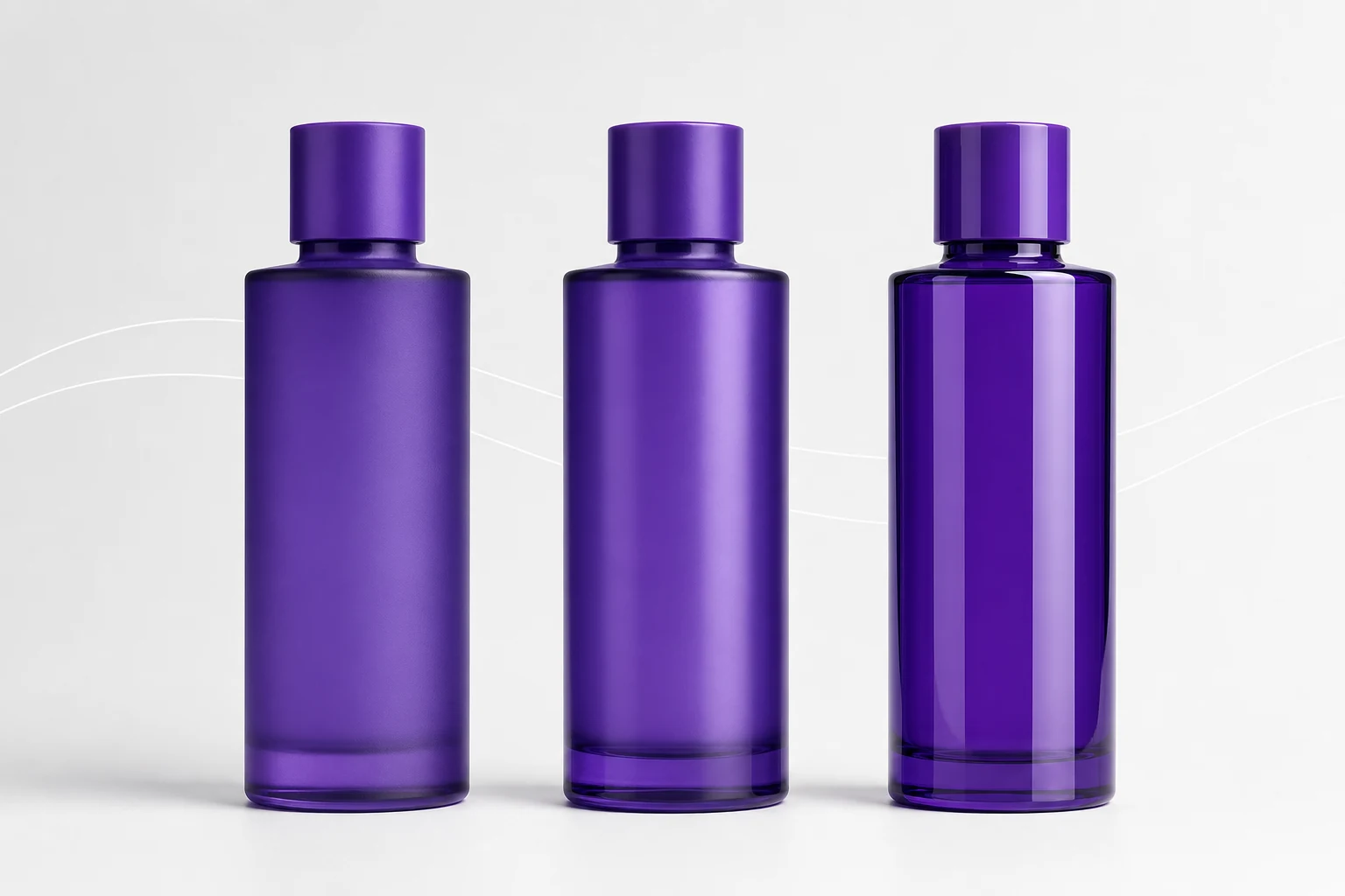
Choose matte for restrained low-glare color, satin for balanced reflection and handling, or gloss for maximum depth and sharp highlights, then approve the exact sheen on the real coated container.
Matte, satin, and gloss are often presented as style choices. In production they also influence color appearance, fingerprint visibility, abrasion behavior, defect visibility, photography, and how direct-print artwork separates from the background.
The correct finish is the one that supports the package's use and visual hierarchy, not simply the finish currently associated with “premium.”
How sheen changes what the eye sees
A gloss surface produces sharper specular reflections. Those highlights can make a color feel deeper and more saturated, but they also reveal surface waviness, dust, craters, and handling marks. Matte scatters reflection more broadly, reducing glare and creating a quieter field. Satin sits between them, retaining controlled highlights without the mirror-like behavior of full gloss.
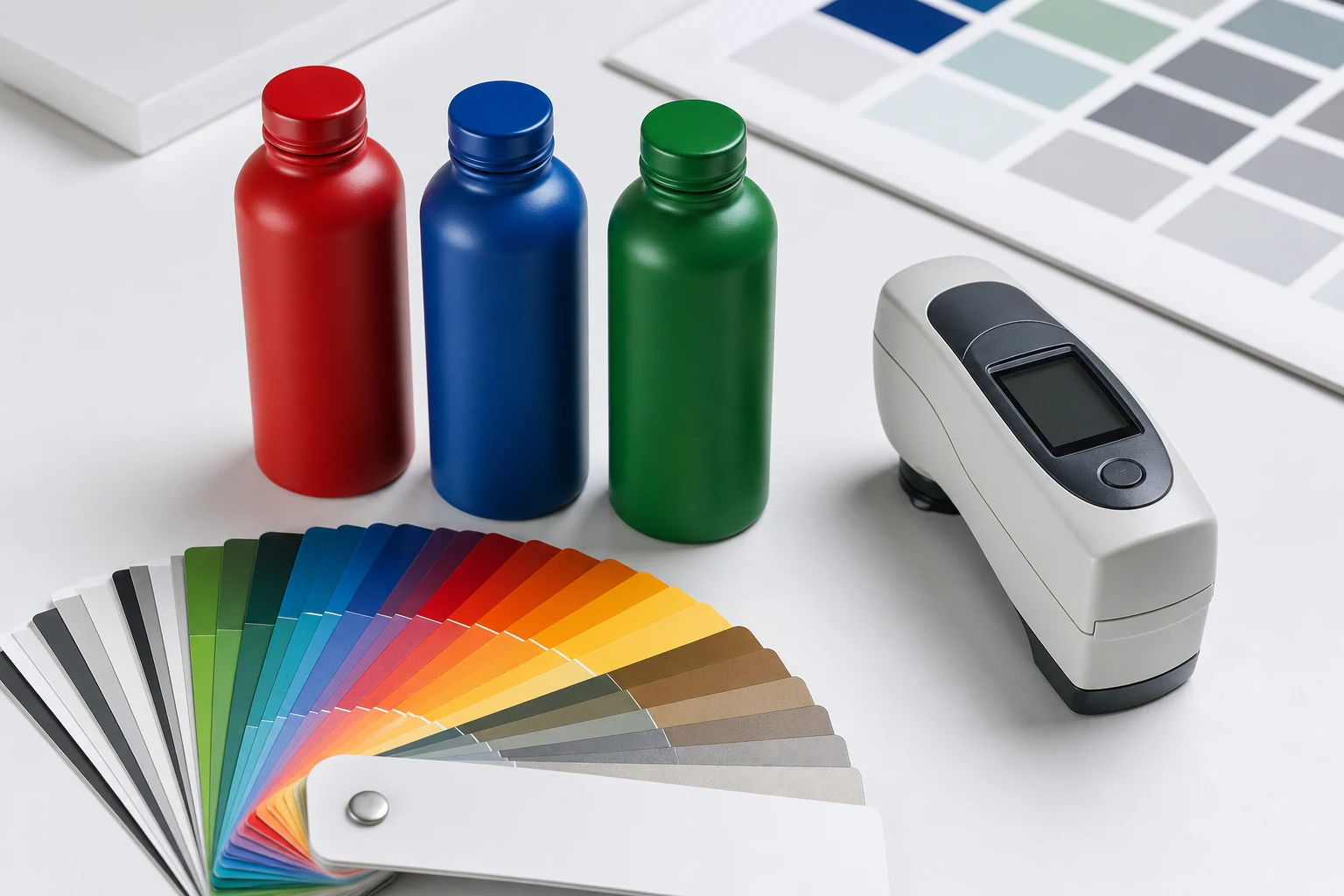
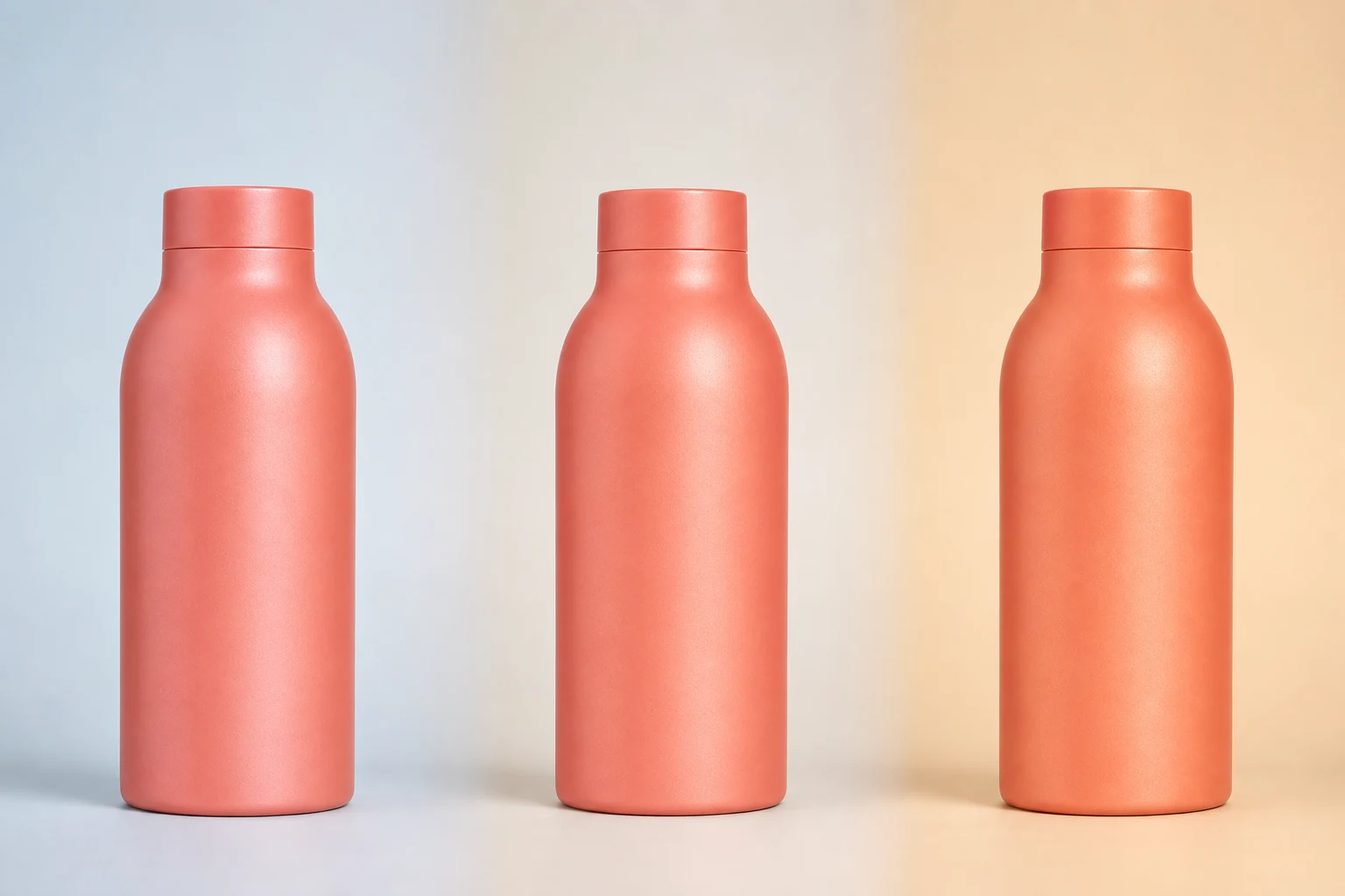
Because reflection changes color perception, the same nominal pigment can look different across gloss levels. A digital hex value cannot predict that interaction. Approval should use coated physical samples viewed under the lighting conditions that matter to the brand.
| Finish | Visual character | Practical strength | Common tradeoff |
|---|---|---|---|
| Matte | Soft, low-glare, graphic | Reduces distracting reflection | Can burnish or show polished handling zones |
| Satin | Controlled, rounded highlights | Balanced color depth and handling | Less dramatic than either extreme |
| Gloss | Deep color, crisp reflection | Strong shelf and photography impact | Shows contamination and surface defects readily |
Matte is not the same as texture
A smooth matte film and a physically textured film may have similar gloss readings but behave differently. Texture can affect small type, overprinting, code readability, cleaning, and tactile feel. Specify texture separately from sheen.
Matte appearance can also change after repeated rubbing if high-contact areas become smoother. That does not automatically mean coating failure, but it may be visually unacceptable for a package handled every day. Include rub or use simulation when the tactile experience is important.
Satin is a useful production middle ground
Satin often preserves enough reflection to communicate curved geometry while reducing the hard glare of gloss. It can be particularly effective when artwork uses both opaque and open elements because the viewer still sees the bottle's form beneath the graphic.
Satin should not be treated as a universal midpoint. Suppliers may use terms such as eggshell, semi-matte, semi-gloss, or silk for different ranges. Define the target using a physical standard and, where appropriate, an agreed measurement geometry and tolerance.
Gloss amplifies both color and defects
High gloss can make rich colors and photographic printing feel exceptionally crisp. It also creates the least forgiving inspection surface. Dust, pinholes, orange peel, scratches, and coating thickness variation can become visible under linear lights.
If the package will be photographed frequently, test it with the intended lighting setup. A finish that looks spectacular in the hand may require careful highlight management in ecommerce photography. Conversely, a very matte package can lose shape if the lighting is too flat.
Coordinate the artwork with the reflection
Direct print and background finish should create a deliberate hierarchy:
- Use opaque white or high-contrast spot colors where legibility must remain stable.
- Let open artwork reveal the surface when the finish is part of the design.
- Check fine type on textured or heavily flaked coatings.
- Evaluate dark-on-dark artwork under both diffuse and directional light.
- Inspect gradients and photographs for contrast loss on reflective metallic backgrounds.
How to approve sheen
Record the powder or coating system, substrate, color, application method, cure condition, and film target associated with the approved sample. Keep a protected master and define how production samples will be compared.
Gloss numbers are only useful when the measurement geometry, instrument, calibration, sample curvature, and acceptance method are agreed. Curved containers can be difficult to measure consistently, so visual standards and controlled lighting remain important even when instrumental data is used.
The Powder Coating Institute notes that powder finishes are available across a broad range of colors and textures. Its glossary also distinguishes surface defects such as cratering and orange peel, both of which can interact strongly with sheen. See the PCI glossary.
Specification questions
- Is the priority low glare, tactile softness, color depth, or sharp reflection?
- Where and how will the package be handled?
- Does the artwork need the background to remain visually active?
- Will the package be photographed under hard studio lighting?
- What visible change after rubbing or chemical exposure is acceptable?
- Which physical standard represents the approved production appearance?