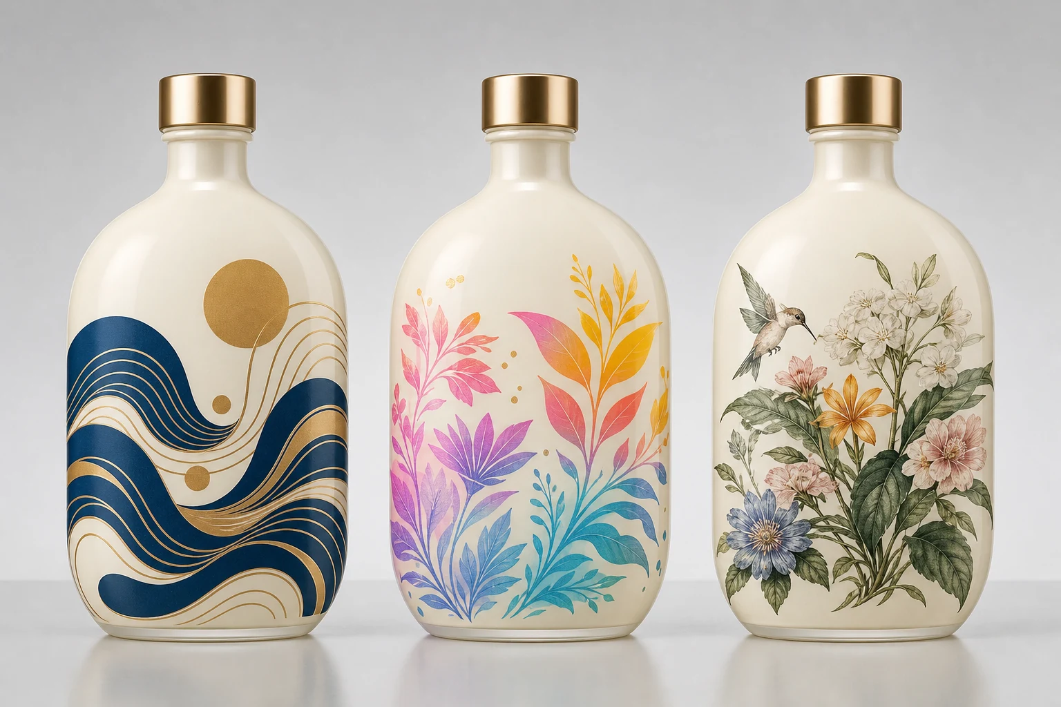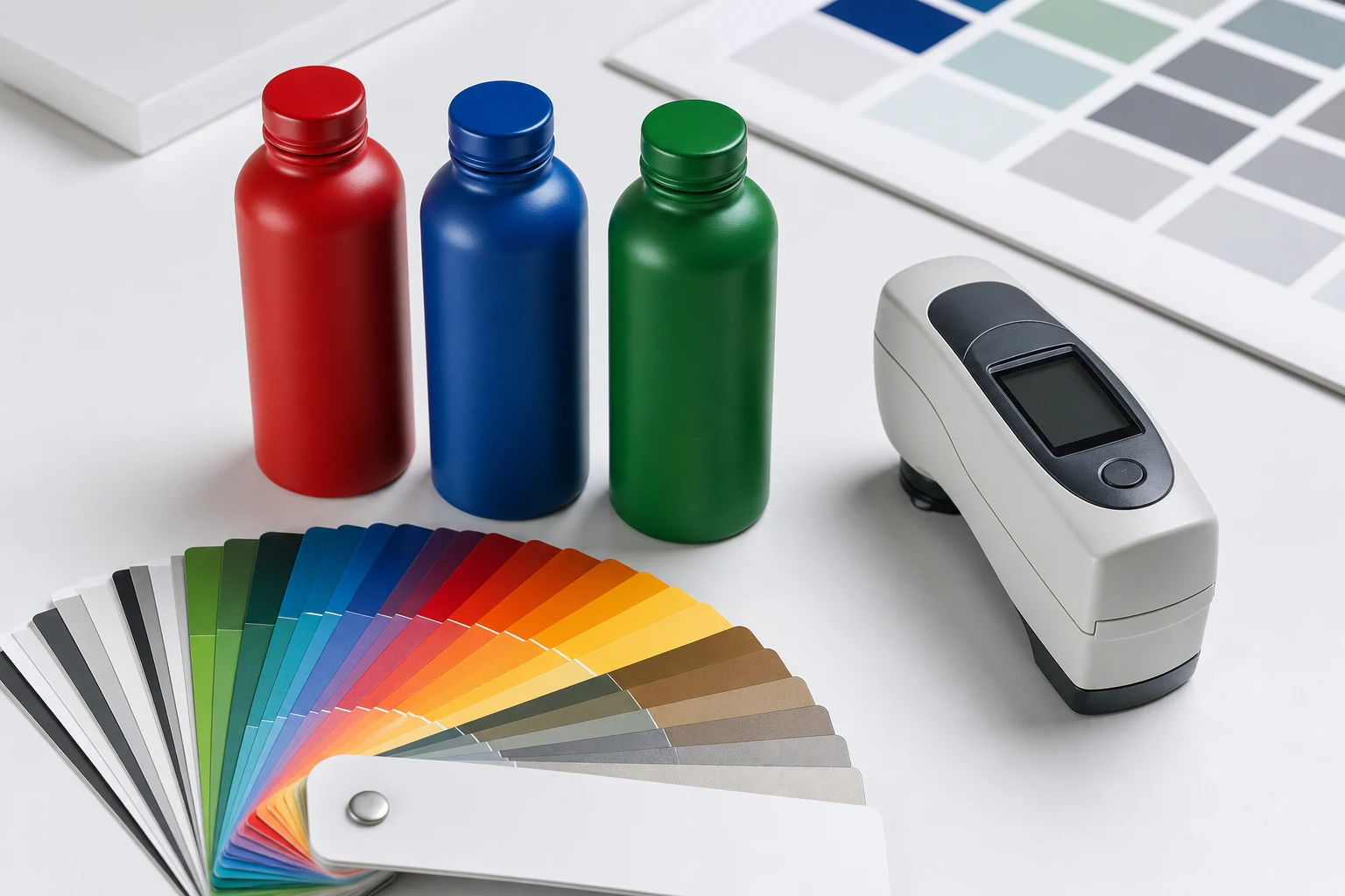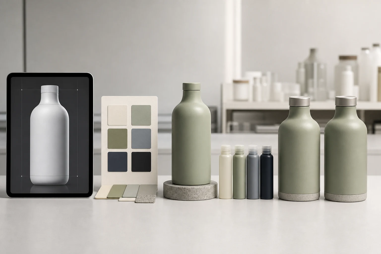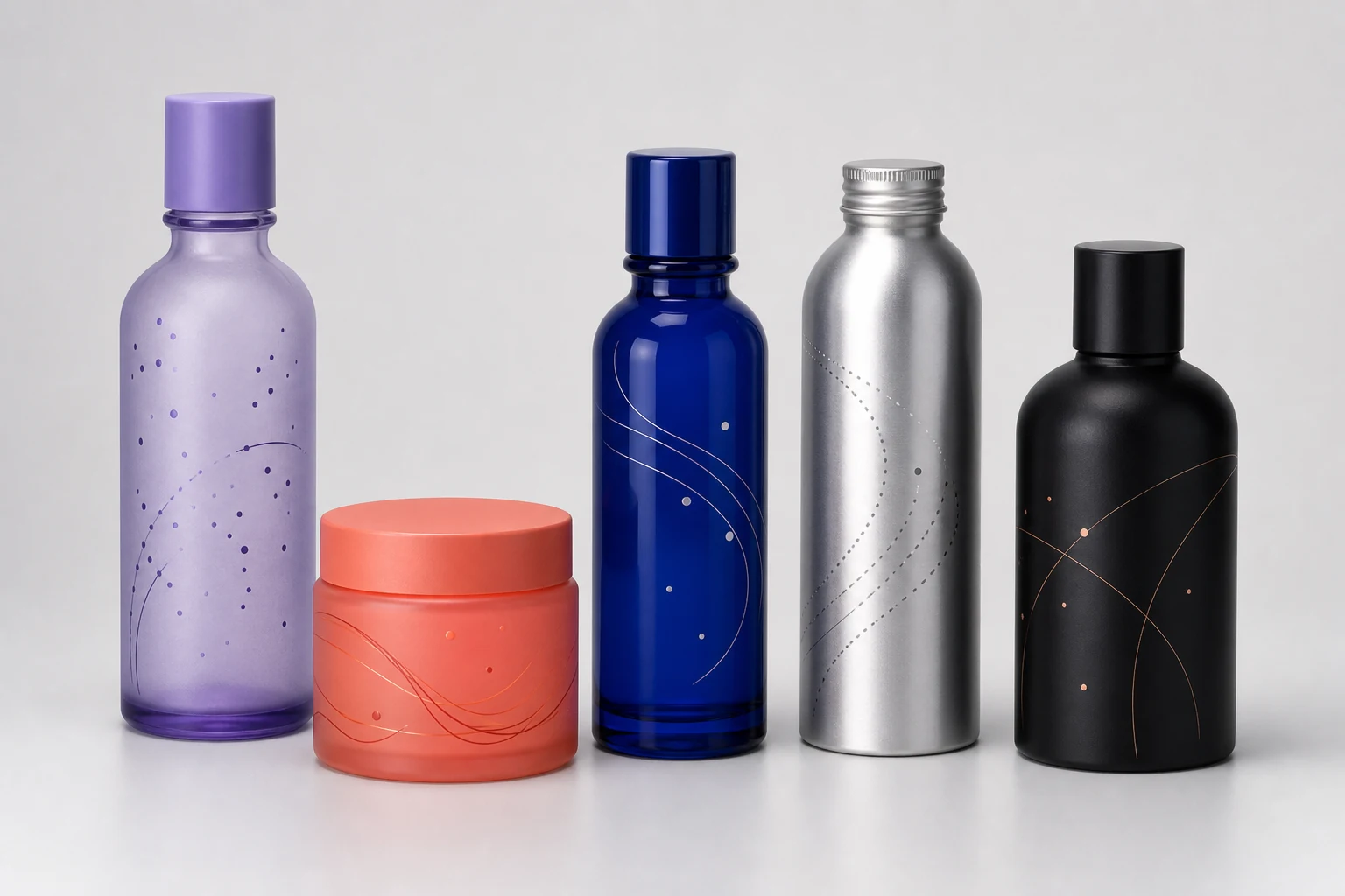
A successful decorated package starts by locking the container and performance requirements, then develops the background, direct-print artwork, and optional QR identity as one tested system.
Bottle decoration is easiest to understand as a system rather than a list of isolated effects. The container supplies the geometry. The coating establishes color, opacity, sheen, and touch. Printing carries the brand image. A connected code can add an identity that continues after the package leaves production.
When those decisions are made separately, familiar problems appear: a beautiful color hides the contrast needed by the artwork, a wrap exceeds the printable arc, or a QR code is reduced until it no longer scans reliably. A better process resolves the physical constraints before visual refinement.
Begin with the actual container
Decoration should be developed on production-representative containers, not a generic cylinder. Record the substrate, supplier, capacity, diameter, height, taper, shoulder transition, base profile, neck finish, seams, and closure interface.
Glass and metal behave differently through cleaning, coating, curing, handling, and inspection. Even two nominally identical glass bottles can vary in surface condition or geometry. Metal containers can introduce forming lubricants, oxides, or small shape changes that affect pretreatment and registration.
The first production drawing should establish:
- The printable body area and any restricted back zone
- The minimum distance from the shoulder, base, and neck
- The intended viewing front and closure orientation
- Areas handled by rails, chucks, grippers, or inspection equipment
- Whether the coating covers the base, shoulder, or closure components
Build the package in three layers
| Layer | Primary decision | Production question |
|---|---|---|
| Surface | Color, opacity, sheen, texture, effect | Will it adhere, cure, and survive the product environment? |
| Image | Screen, UV digital, or high-detail print | Can the artwork reproduce and register on this geometry? |
| Identity | Static or serialized QR | Is the code large, quiet, and durable enough to scan? |
Powder coating is a dry finishing process in which a formulated powder is deposited and cured into a continuous film. The conventional electrostatic process is most common on grounded metal, while non-metal substrates require an application system engineered for their electrical and thermal behavior. The Powder Coating Institute overview is a useful baseline, but the actual package process still has to be qualified on the intended container.
Direct printing avoids the visible edge and separate material layer of a pressure-sensitive label. It also makes the surface part of the artwork: open areas, knockouts, and floating elements can intentionally reveal the coating below.
Choose the surface before finalizing artwork
Start with a physical color target and an expected sheen. A matte black, gloss black, and metallic black may share similar digital values while behaving very differently under retail lighting. Transparent or frost effects on glass also change with fill color and wall thickness.
For powder programs, RAL can provide a practical target language. RAL CLASSIC contains 216 historically assembled shades, while RAL DESIGN SYSTEM plus is organized using hue, lightness, and chroma. RAL explains that the two systems serve different purposes and that physical references are important for identification. See the RAL color system FAQ.
Artwork should then be evaluated over the chosen surface. A translucent yellow image may disappear on a warm metallic background. Small white type may need a dedicated white print layer on a dark coating. A photograph intended for digital print may need gamut and contrast adjustments for a reflective substrate.
Match the print method to the image
Screen print is strongest when the design uses a small number of deliberate spot colors, high opacity, and simple floating forms. Each color is separated and registered, so the artwork should be designed around the approved color count.
UV digital print is appropriate for gradients, many colors, variable images, and shorter design cycles. Industrial UV inkjet systems can support CMYK plus white and additional gamut colors for direct-to-shape applications, as shown in Siegwerk's direct-print ink overview.
High-detail powder print is selected when photographic detail and a premium directly decorated appearance are central to the design. Qualification should confirm the achievable detail, color, adhesion, and wrap on the actual container.
Approve performance, not appearance alone
A visual sample is not a complete production approval. The test plan should reflect filling, capping, packing, shipping, storage, and use. Typical evaluations include adhesion, abrasion, chemical exposure, moisture, temperature, color, gloss, and code readability.
ASTM D3359 describes tape-test methods for rating adhesion on metallic substrates and explicitly notes their limits. ISO 2409 defines a related cross-cut classification method and states that it assesses resistance to separation rather than measuring adhesion force. Use the method and acceptance criterion named in the specification, not an informal “tape test passed” note. See ASTM D3359 and ISO 2409.
Create a production-ready brief
Before requesting a final quote, provide the container drawing and samples, annual and launch quantities, destination markets, filling conditions, product-contact concerns, desired finish, color reference, artwork files, quality requirements, and schedule.
The goal is not to eliminate every open question. It is to identify which questions require samples, testing, or a production trial before the visual direction becomes expensive to change.