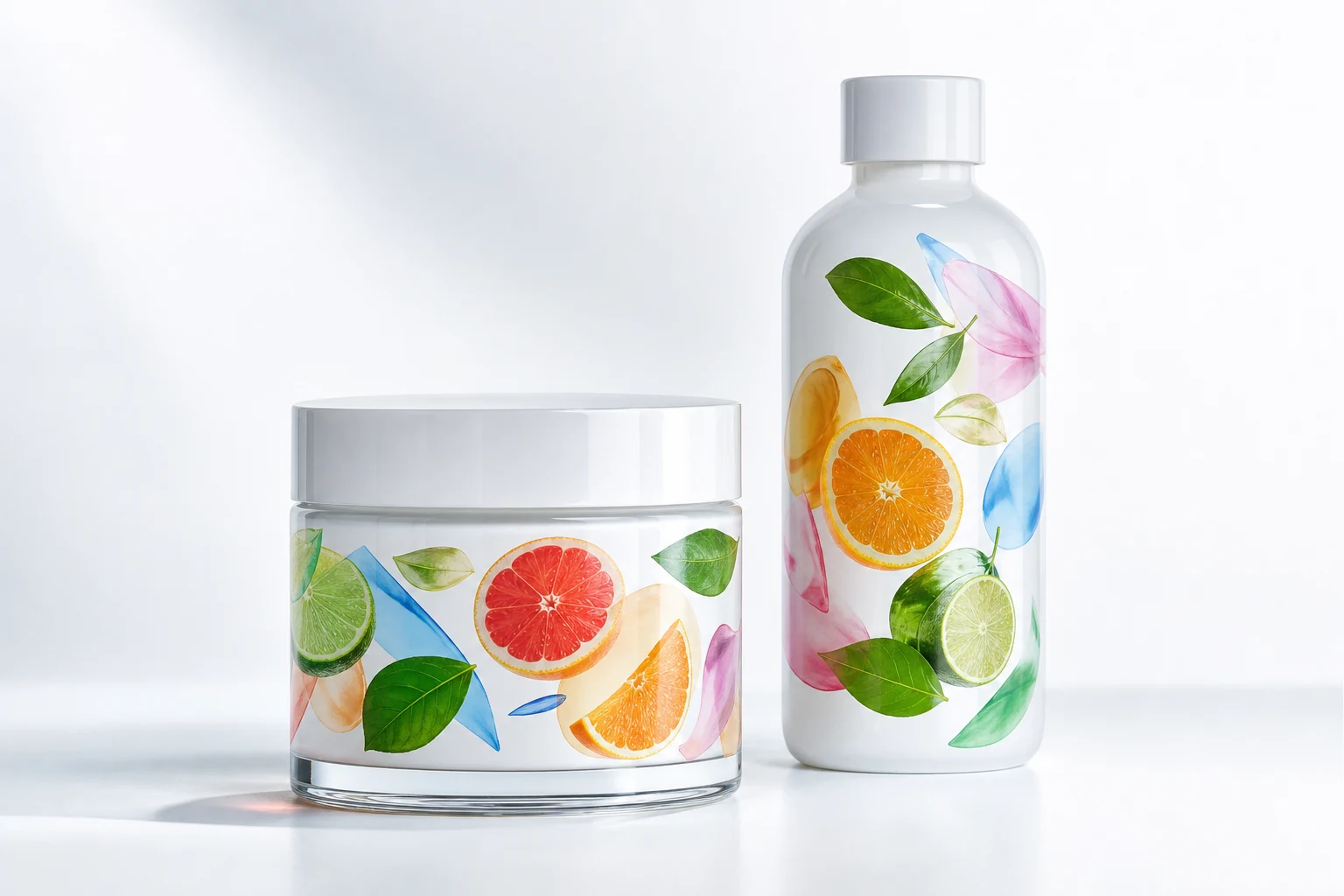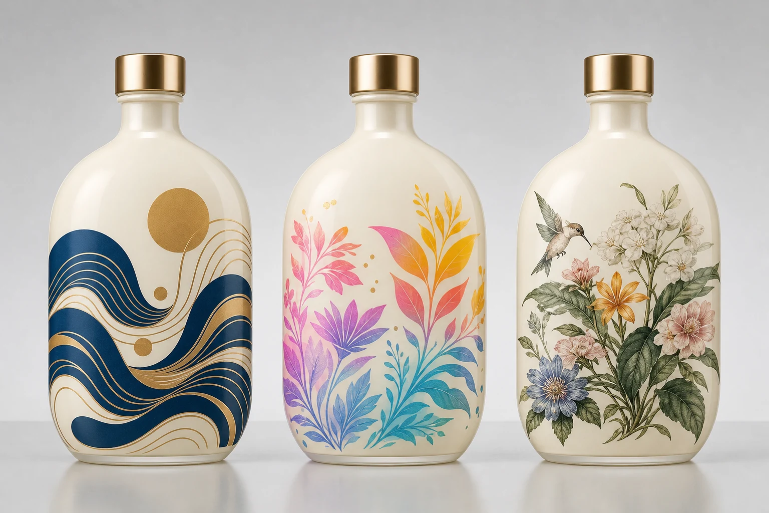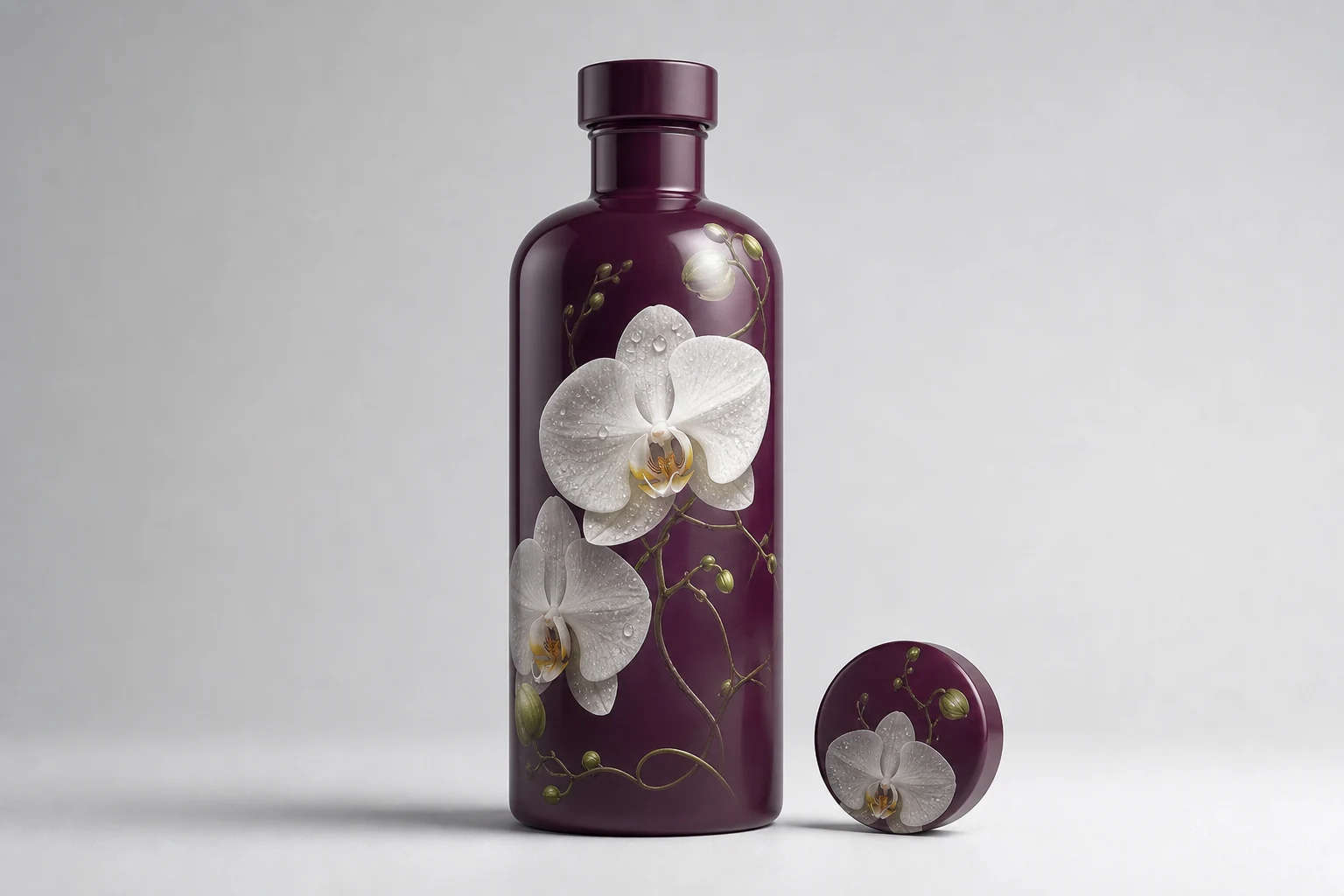
The strongest photorealistic direct print combines high-resolution image detail with selective opacity, clean masks, and open negative space that allows the powder-coated package to remain visible.
Photographic capability changes what direct package decoration can express: botanical detail, skin and product imagery, fine texture, subtle tonal transitions, and artwork that moves between opaque and transparent regions. The design challenge is to use that detail without rebuilding a label as a rectangle of ink.
Start with a composition made for the object
A flat photograph usually contains a complete background. Printed unchanged, it becomes a rectangular panel. Direct decoration is more convincing when the image is recomposed for the package:
- Isolate subjects with production-quality masks
- Extend leaves, particles, or forms beyond a central image area
- Use controlled fades into the powder background
- Reserve open space around branding and required copy
- Place important features away from wrap limits and curved transitions
The coating is not empty space. It is one of the image's materials.
Preserve real image information
Use the original high-resolution photograph or render, not an image downloaded from a presentation or social platform. Avoid repeated JPEG saving because it adds blocking and edge artifacts. Adobe notes that repeated JPEG exports can introduce wave-like and blocky artifacts. See Adobe export guidance.
Place raster images at sufficient effective resolution for their final printed size. “Effective” matters because scaling a small image up inside a layout reduces its usable pixel density. Sharpening cannot recreate missing detail.
Separate color, white, and openness
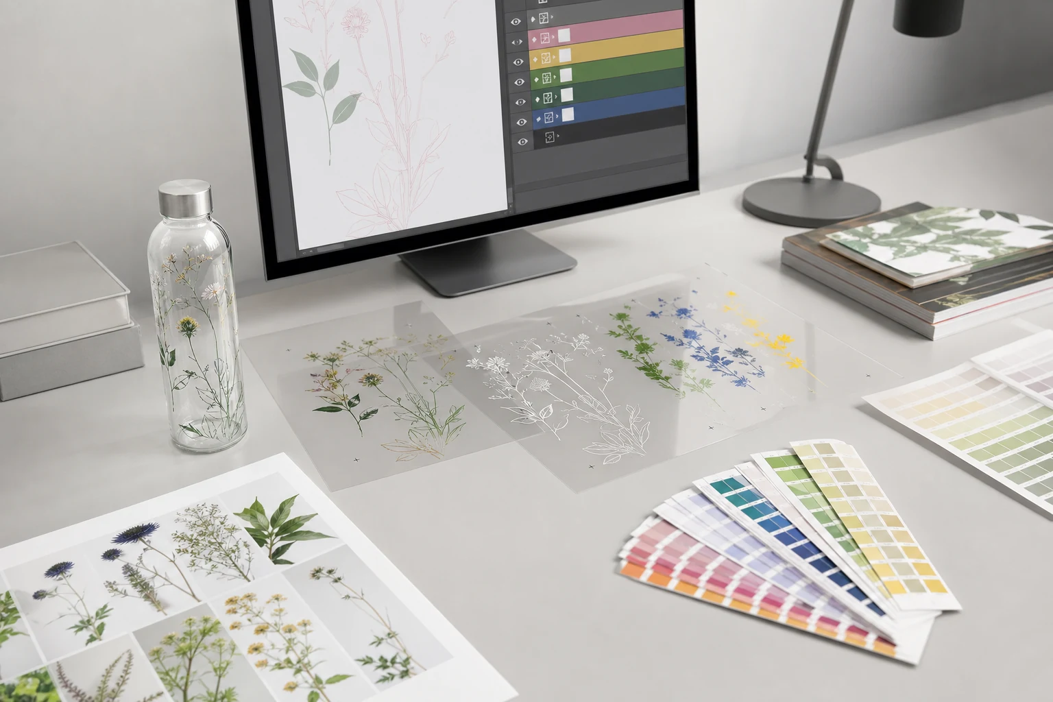
High-detail decoration may need more than one conceptual image layer:
- Color image: the continuous-tone artwork.
- White behavior: where color needs opacity or a visible white foundation.
- Open package: regions where no ink should obscure the coating.
- Vector copy: logos, type, rules, and codes kept crisp and editable.
Do not automatically put solid white behind the entire photograph. Selective white can preserve color where needed while allowing shadows, soft edges, and atmospheric elements to interact with the background.
Build contrast for the selected finish
The same photograph will not reproduce identically on matte black, gloss white, metallic gold, and translucent frost. Dark backgrounds compress shadows. Metallic reflection can compete with midtone detail. Strongly colored coatings influence transparent areas.
Create the image treatment after choosing the background. Then proof the two together. A monitor preview can help composition, but physical output is required for final color and opacity decisions because displays emit light while packages reflect it.
Curvature changes the image hierarchy
Only part of a cylindrical wrap is visible from one viewing angle. Keep the primary subject and brand mark inside the intended front view, then use secondary details to reward rotation. Avoid placing a face, circular seal, or essential word across the back restriction or a region with strong geometric distortion.
Test the physical package from four views: front, right, back, and left. That catches dead zones, awkward crops, and competing elements that a flat wrap cannot show.
File construction checklist
- Supply layered source artwork plus a production PDF
- Preserve embedded ICC profiles in raster images
- Keep logos, type, and codes as vector objects
- Provide editable masks for isolated subjects
- Name white, varnish, and special channels clearly
- Include bleed or fade behavior required at the qualified wrap limit
- Remove hidden images and unused alternate layers
- Package linked assets and fonts, with outlined final display type where requested
- Include a visual reference showing the expected coated background
ICC guidance explains that reliable output color requires a relationship between device data and a device-independent color space. Where the output process has a profile or characterization, use it for conversion and proofing. See ICC profile creation.
Approval criteria
Judge more than “photo quality.” Approve subject detail, skin or botanical color, neutral balance, gradients, edge masks, white registration, open-area cleanliness, wrap transition, adhesion, abrasion, and appearance under the intended light.
The objective is not to make the bottle imitate a paper print. It is to use photographic information while preserving the depth and continuity of a directly decorated surface.